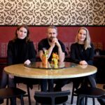
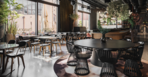
Tigermom is a brand new, one-of-a-kind restaurant in Copenhagen. Here is created room for people – and by a person – with character and diversity. The interior design concept was developed by All That Matters and here they explain how they created a restaurant with a unique atmosphere that gives it an edge and makes it stand out.
Our vision for Tigermom was to create a surprising, eccentric, and intriguing space with traditional aesthetics as the foundation in combination with a bold, playful, and independent expression with intense colors and quirky details.
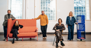
This project was inspired by Lisa, the founder of Tigermom. Her personality radiates international edginess, strength, femininity, and a modern take on the Asian culinary scene. Lisa had many different ideas and inspirations for the space, which made it our job to collect, filter, and assemble her considerations in one coherent vision.
Our process often starts with a meeting with the client to gain insight into their personality as well as their wishes, goals, and the drive behind the concept. We walk around the space and start envisioning the possibilities. Once we gather all the needed data and information, the design process is initiated.
Some clients are more personally invested than others and it only benefits the designers if the client is excited and passionate about the process. This was the case with Tigermom, which resulted in a direction that took its starting point in the client rather than by looking for specific brands or contemporary trends to suit the project. This approach has allowed Tigermom to become a unique and 100% customized solution for Lisa and her culinary visions.
Contrasting elements are key
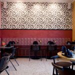
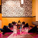
We focused on finding contrasting materials by combining down-to-earth plastic chairs that remind you of local street food markets, authentic dining experiences, and lavish patterned wallpaper and fabric. We worked within the same collections but used different fabric colors to create variation in each area.
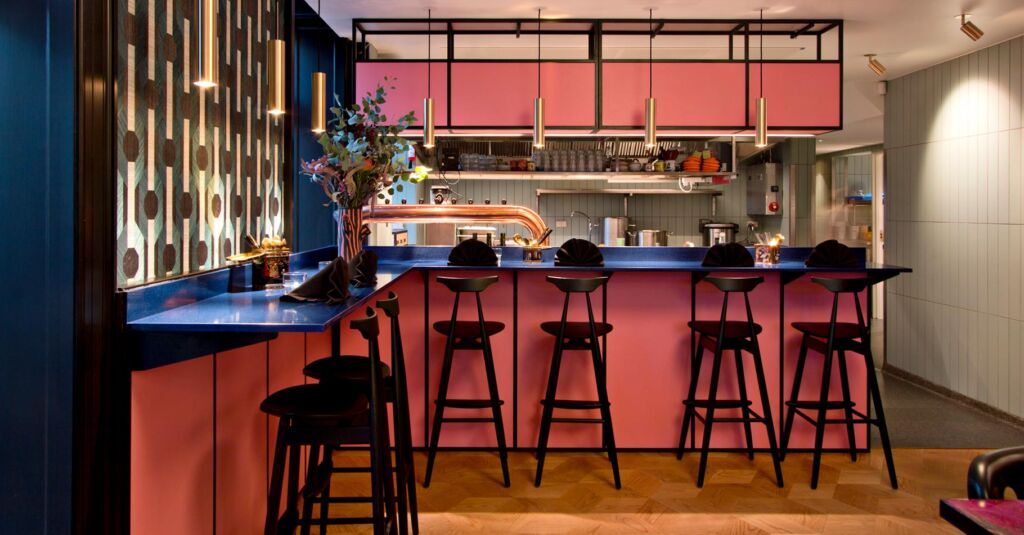
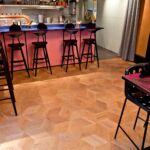
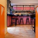
Another contrast was created with the lighting. We chose very classic pieces to tone down other slightly wilder elements such as the glittery table tops and bright pink bar fronts.
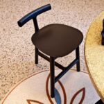
The Robin Day chairs also stand in great contrast to the high-quality craftsmanship of the Wohlert barstools from Stellar Works. In many other interior design solutions, these differences would likely clash; however, in this case the contrasting elements definitely complement each other.
One of Lisa’s wishes was to have a restaurant with an open kitchen. She wanted to give her customers an intimate dining experience with visible food preparation. This can be difficult to incorporate in a solution; however, by choosing a large matt colored tile for the kitchen, we were able to bring it into the design rather than hide it away.
It’s all in the details
We emphasized the small details because we believe that the detailing in a project is what leaves a lasting impression on future guests. The most extravagant area is the smallest space in the restaurant – the coatroom. This has been decked out in plush velvet, brass hangers, and neon lighting. Upon arriving at the restaurant, guests walk through the entry way with burgundy metal screens. Instead of choosing a classic pattern, we decided on a simple but different heart pattern that creates an interesting custom feature in the interior design.
At first glance, the flooring also looks traditional but when taking a closer look, you see the elegant hexagon pattern which adds yet another decorative feature.
To conclude, every corner meets guests with a new discovery as the space comprises many universes that all intertwine into a unique and cohesive interior. The intent was to leave guests with a feeling of curiosity, fun, happiness, and down-to-earth city life.

